Testimonials from clients whom I have had the honour to work with:
“It was a pleasure working with the team. Not only was the entire process extremely smooth sailing, the team has been nothing but extremely helpful, even beyond the completion of the project.”
— The Lo&Behold Group
“A heartfelt ‘thank you’ to the craftsmen, the designers and the dreamers who continue to make our vision a reality.”
— Chef Julien Royer, Odette
“Two years of research, interviewing experts and testing products ourselves. We ended up partnering with people who care as much as we do, and worked closely with them.”
— Darryn, Two of a Kind
“Very happy with the overall service and assistance! The team is talented, problem-solving, responsive and accommodating to our needs. They’re flexible as well in dealing with last minute requests/changes/ad hoc requests and do the best they can – really appreciate this quality. Appreciate it guys!”
— Krystal, Blue Sky Escapes
“Very impressed by their professionalism – Shawn adopts an effective way of understanding our needs and business model. The team was thorough in their research and meticulous in their methods, ultimately crafting a brand that accurately reflects our vision and mission.”
— Jeanette, DDIY
SL © 2026
Two of a Kind
Project: Visual Identity, Corporate Branding, and selected Design works
Sector: Eye Care Industry
Images © Two of a Kind, The Straits Times, and Her World
Project: Visual Identity, Corporate Branding, and selected Design works
Sector: Eye Care Industry
Images © Two of a Kind, The Straits Times, and Her World
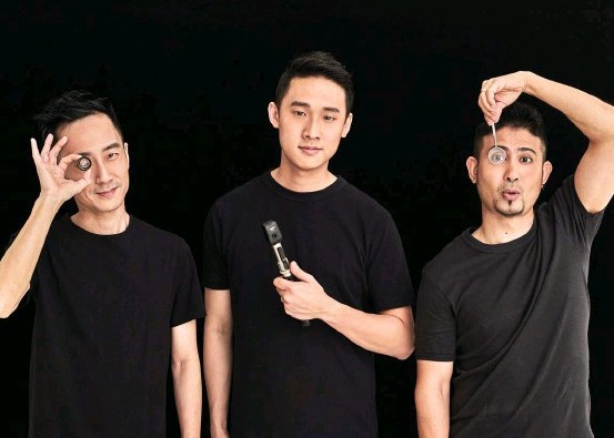
Two of a Kind is a contact lens subscription-based start up offering competitive prices with the highest safety standards. Their business model disrupts the contact lens market that is currently being run by big players, by cutting out the middle man and focus on bringing the best quality, experience and value to the customers.
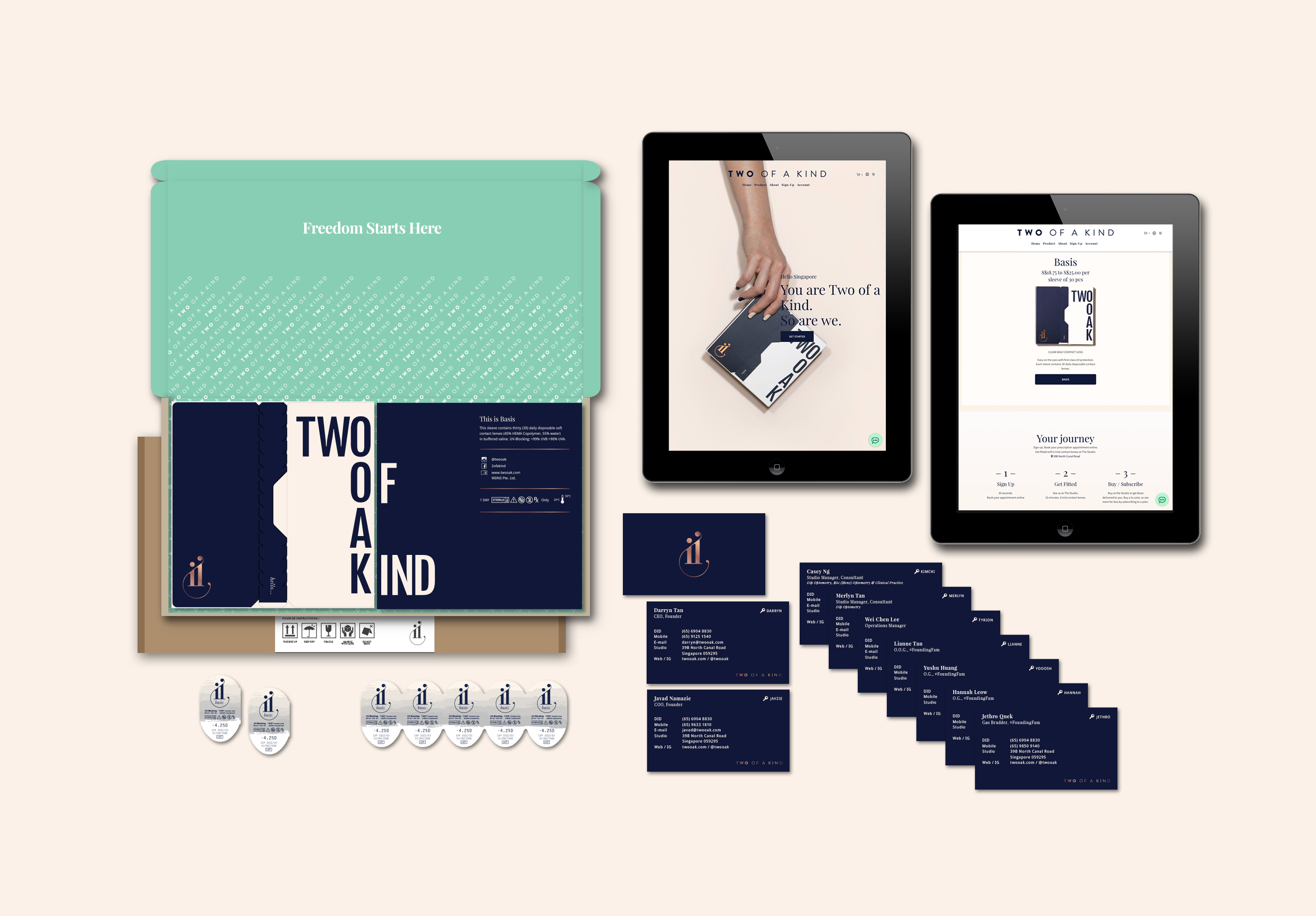
We were engaged by the good lads at TWOOAK for a visual identity and branding engagement that spans from the intangible phase of conceptualization and art direction, all the way to the brand’s corporate identity and physical packaging design. The main goal of this project was to design and develop a seamless brand and intuitive e-commerce solution to enable TWOOAK to reach out to its potential customers, for customers to sign up for subscriptions, and to retain existing customers.
Two of a Kind was created with the intention of realising a strong brand recognition amongst the users. Initial design discussions constantly shifts around the idea of creating a brand that would bring value to the users and that the users would love to be associated with, a brand that they would constantly carry around and show off physically or online.
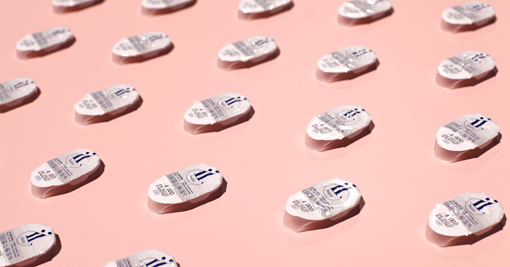
We designed and balanced the brand to created an identity that would provide a cohesive experience for the customers—from online social media posts and website, all the way to the receiving of their package in their mailboxes. Our focus was to create a brand that is visually engaging with great aesthetics on all touch points. In order for the company to retain users and encourage recurring sales via subscription, we knew that the packaging has to be well-received and “instagrammable”.
These thought processes and objectives are then boiled down and translated onto the final packaging design for the brand. Sleek copper-foiled logo stamp accompanied by easy rip and tear perforation sees the packaging quickly gaining affection and shoutouts from customers on social media platforms.
The brand would then go on to disrupt the contact lens industry and get featured in notable press such as The Straits Times, The Business Times, Buro 24/7, Peak, Singapore Home Decor, Her World and Female magazines.